Turning a vague public-sector brief into a product the Berlin Senate still runs
A product developed for the Senatsverwaltung für Wissenschaft, Gesundheit und Pflege Berlin, with care and gerontology expertise contributed by Albatros gGmbH.
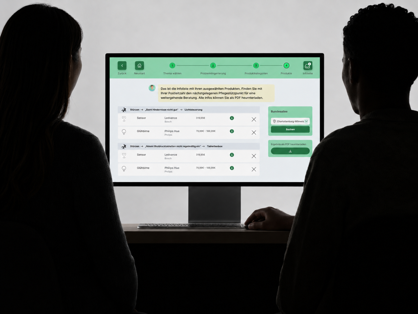
Nobody knows what to buy
The market for Pflege 4.0 assistive technology is fragmented. Caregivers, their relatives and professional advisors have no way to find out which product fits the situation they are actually in.
A guided tool for the moment before anyone knows what to buy: you describe a situation, and it finds the assistive technology that fits it.
A multidisciplinary brief from the public sector
Commissioned by the Berlin Senate Administration for Science, Health and Care.
Albatros gGmbH brought the care and gerontology expertise. Not a client, a domain partner: they kept the design close to how care actually works.
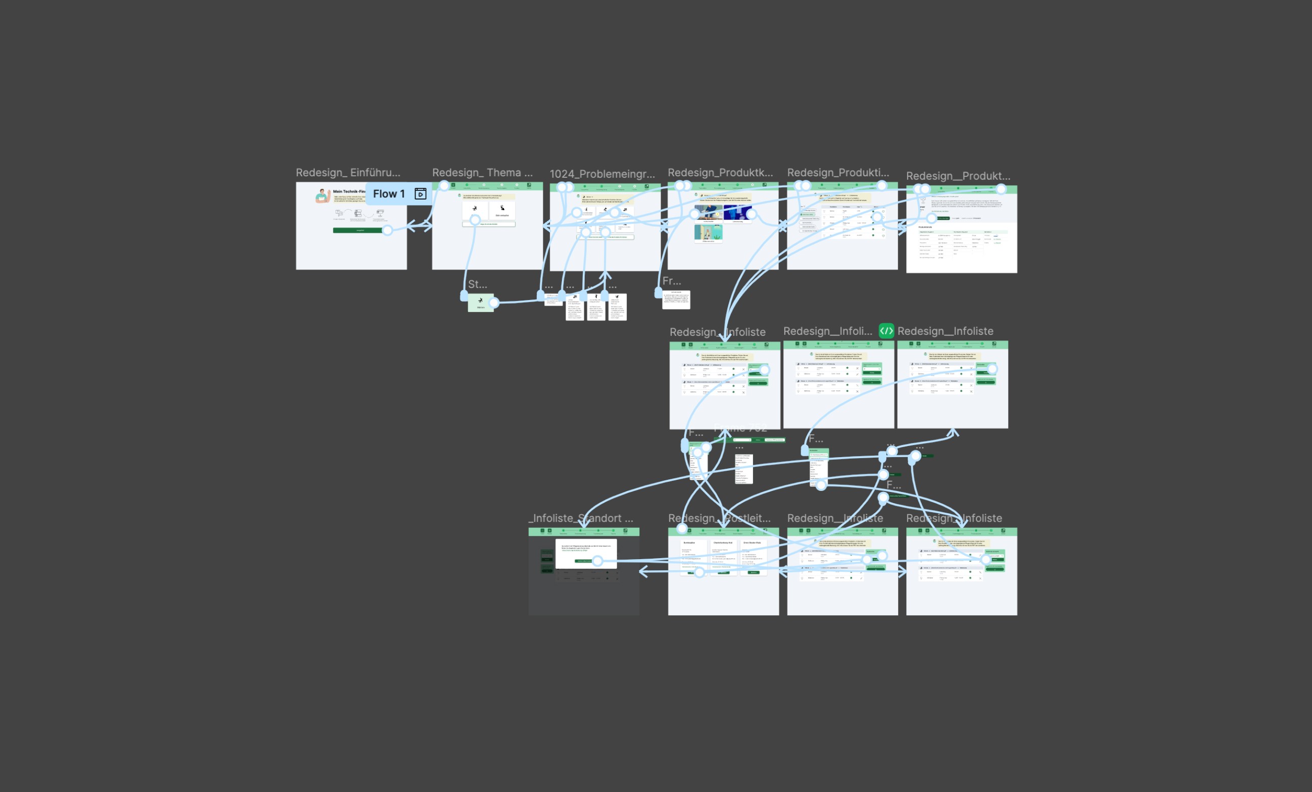
From “something has to change” to a list she can hand over

Jenni
Caring for a relative at home
Someone in her household is at risk of falling. She is looking for assistive technology without knowing the product market, in a week that is already full.
- Find products that fit her actual situation
- Compare them honestly across vendors
- Take a shortlist offline, to family or the doctor
Recognise the problem
- Topic search
- Questionnaire, five questions
- Single choice · Multiple choice
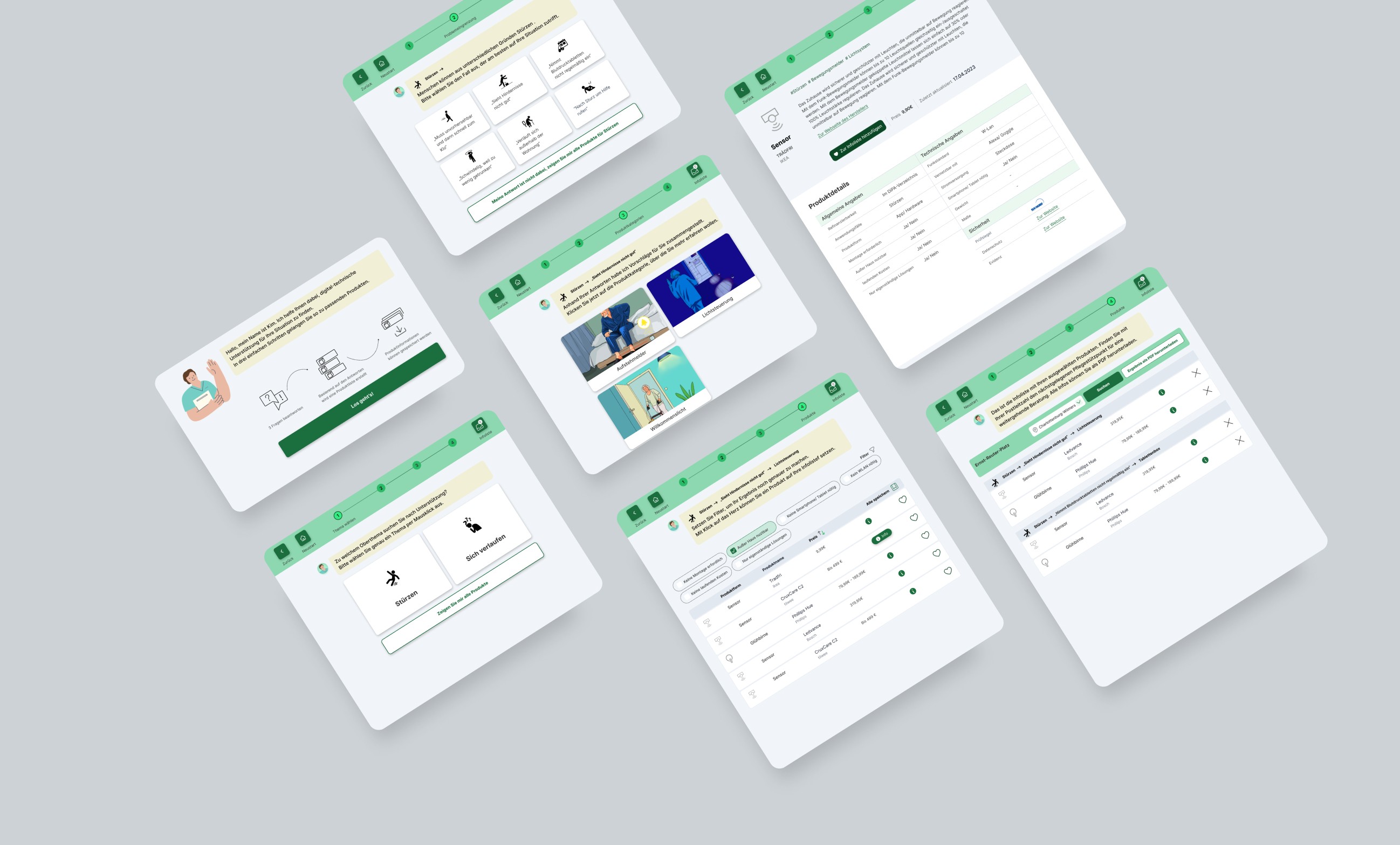
Jenni picks the topic “falls”, then answers five questions about her situation: living alone? care level? mobility?
- Search only works if she already knows the right word
- A fixed set of options never covers every situation
A structured needs assessment replaces the open catalogue. Topics are sorted by need — memory, mobility, independence, pain — not by product category.
A list appears
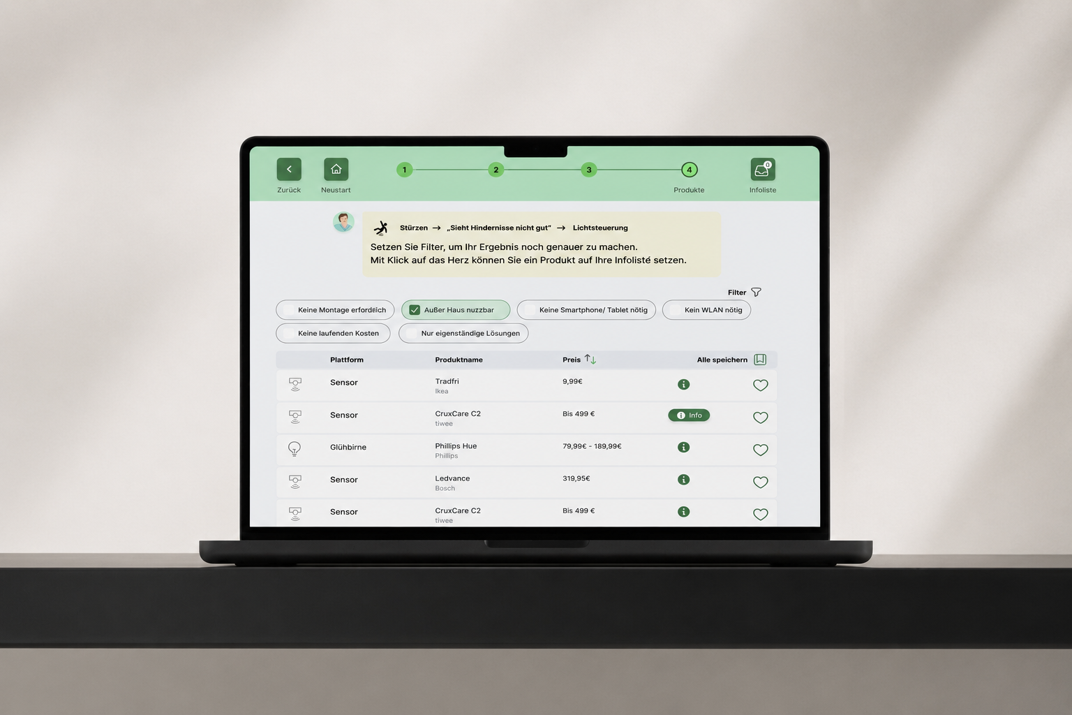
- Generated product list
- One-click adviser, by postcode
She receives a shortlist of assistive products for her situation.
- Nothing yet tells her which of them is right for her
The list is generated from her answers. Product name and one sentence each, nothing more at this depth. A human adviser is one tap away via the local Pflegestützpunkt.
Compare and decide
- Product detail
- Comparison table
- Installation plan
- Manufacturer contact
She opens the products that could fit, compares them, and marks the ones she keeps.
- Vendors describe the same feature in different words
- A comparison across product types would suggest a precision that is not there
Product information is normalised across vendors, so items are genuinely comparable — and comparison stays within a group rather than across types. Anything can be marked and saved.
Take it offline
- Saved shelf
- PDF export
- Decision trail
She drops what she does not need, keeps a few, and takes the list to her family or her doctor.
- The decision does not happen in the browser, and it is not hers alone
Marked products export as a PDF. Her own answers stay visible as a decision trail, so she can explain how the list came about.
Dense domain, simple surface
The tension was clear from the first workshop. The domain is dense: hundreds of products, several care contexts, changing regulation. The user is often an elderly person opening a digital product for the first time, in a stressful week. The product has to carry the complexity without showing it, inside WCAG.
Two of the decisions are easy to miss. A human consultation is one tap away, by postcode, because a tool cannot carry this decision alone. And print is a first-class output, because most care decisions happen offline, with family or at the doctor.
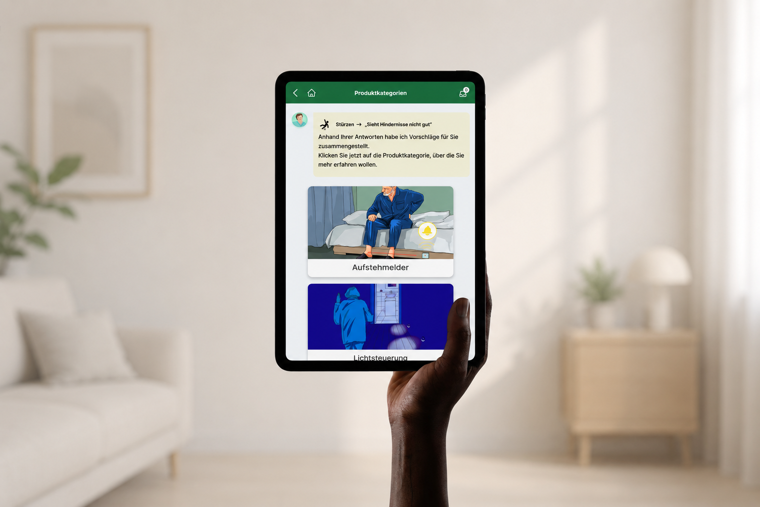
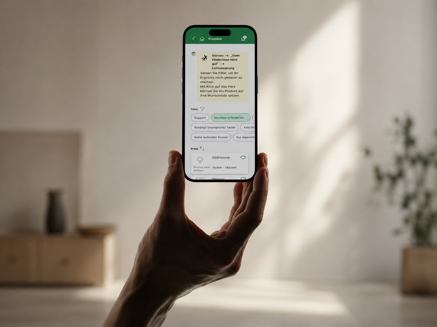
Fewer buttons, one obvious path
The first version carried shortcuts on every step: from anywhere you could jump to anywhere else. On paper that is efficiency. We took almost all of them out, because every extra control is one more question to answer.
The trade is real. Someone who uses the tool every week pays for it in steps. We chose the person who opens it once, in a difficult week.